13. 扩展:绘图模块 Matplotlib
Matplotlib 基于数值计算模块 Numpy,克隆了许多 Matlab 中的函数,能够帮助使用者轻松地获得高质量的二维图像。 一些参考资料:
当我们导入 Matplotlib 之后,有下面两种作图方式
import matplotlib.pyplot as plt

# 第一种作图方式
plt.figure() # 创建画布
plt.plot(x, y)
plt.xlabel('x', label='xxx')
plt.ylabel('y')
plt.set_title('title')
plt.savefig('plot.png')

# 第二种作图方式
fig, ax = plt.subplots() # 创建画布以及获取 axes
ax.plot(x,y)
ax.set_xlabel('x')
ax.set_ylabel('y')
ax.set_title('title')
fig.savefig('plot.png')
一些针对初学者的 Python 作图教程中,往往会大量使用 plt.xxx 这样的作图方式,这其实是 Matplotlib 提供的一个作图的捷径。
虽然能够非常迅速的画出一些简单的图像,简单易懂,但对于一些更复杂的作图要求往往无能为力,尤其是当我们需要面临复杂的科学作图的时候,会被 plt.xxx 的作图方式误导。
第二种作图方式,虽然看起来更加复杂,但是更适合个性化定制所需的图像。
Pylab 和 Pyplot 的关系
Pylab 和 Pyplot 都是 Matplotlib 提供的模块,不同的是 Pyplot 只是单纯的作图模块,但是 Pylab 还包括了 Numpy 中的部分模块和函数, 使得 Pylab 和 Matlab 更加相似。在使用交互界面时用 Pylab,比如ipython --pylab会顺便导入 Matplotlib.pyplot 和 Numpy,更加方便。
首先我们快速浏览一遍 Matplotlib 所能创作的不同的图表类型。
13.1. 图表类型
对于不同的数据,选取合适的图表类型来表达数据的内涵非常重要。 为了方便科学计算和数据分析的初学者,这里给出一个简单的示意图来告诉大家如何选取合适的图表类型。
13.1.1. 折线图
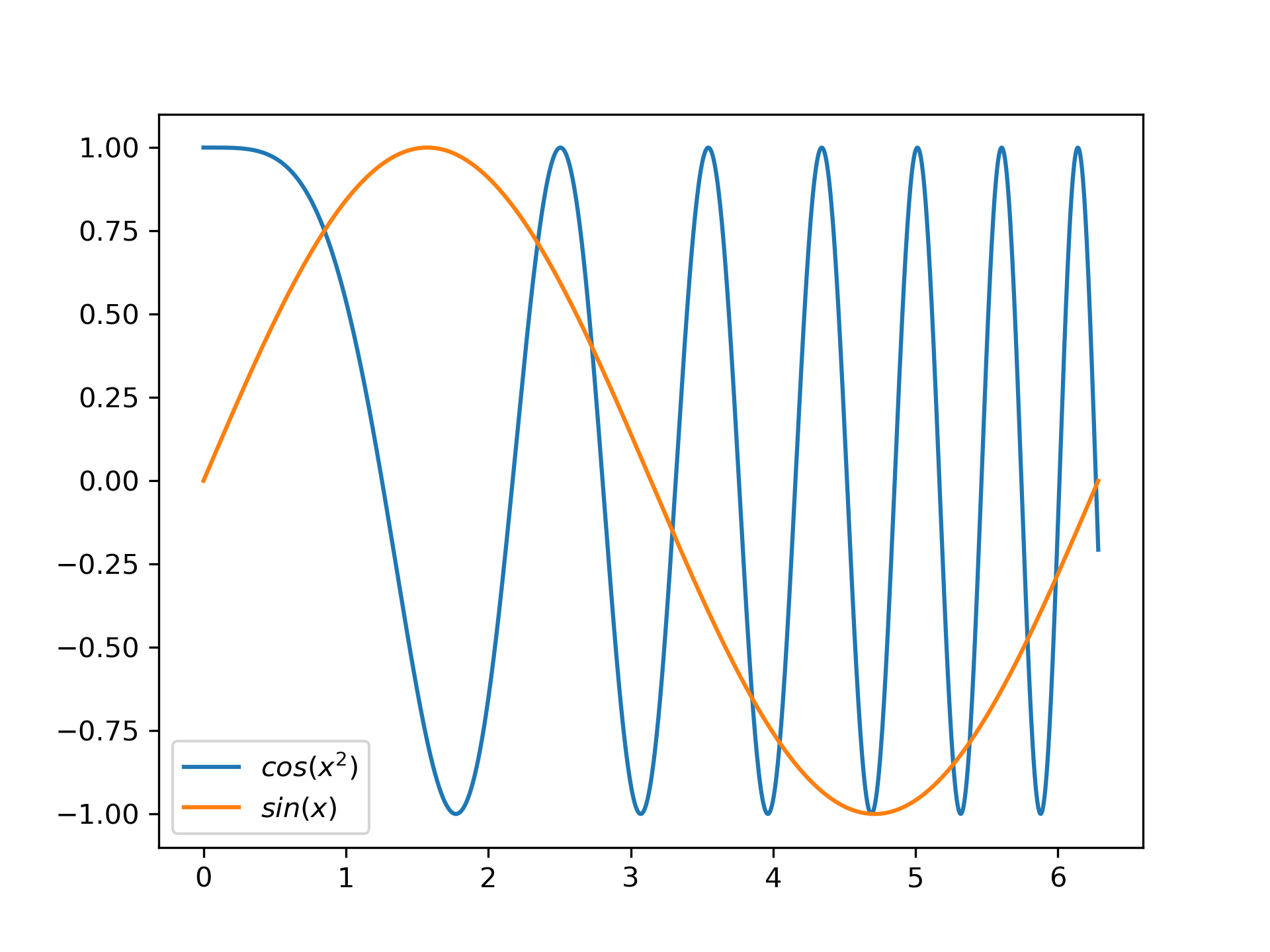
折线图绘制,只要采样点足够多,就能画曲线图。
import numpy as np
import matplotlib.pyplot as plt

x = np.linspace(0, 10, 1000)
y = np.sin(x)
z = np.cos(x ** 2)

plt.figure()
plt.plot(x, y, label="$sin(x)$")
plt.plot(x, z, label="$cos(x^2)$")
plt.legend(loc=3)
plt.show()
plt.close()
运行结果如下
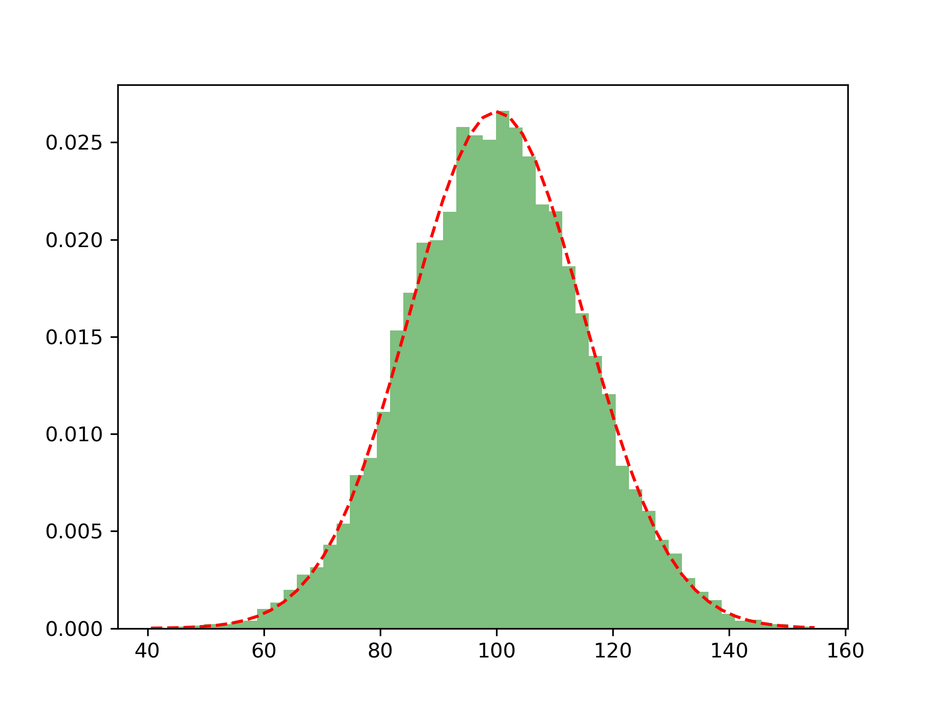
13.1.2. 直方图
import numpy as np
from scipy.stats import norm
import matplotlib.pyplot as plt

mu = 100 # mean of distribution
sigma = 15 # standard deviation of distribution
x = mu + sigma * np.random.randn(10000)
num_bins = 50

# the histogram of the data
plt.figure()
n, bins, patches = plt.hist(x, num_bins, density=True, facecolor='green', alpha=0.5)
y = norm.pdf(bins, mu, sigma)
plt.plot(bins, y, 'r--')
plt.show()
运行结果如下
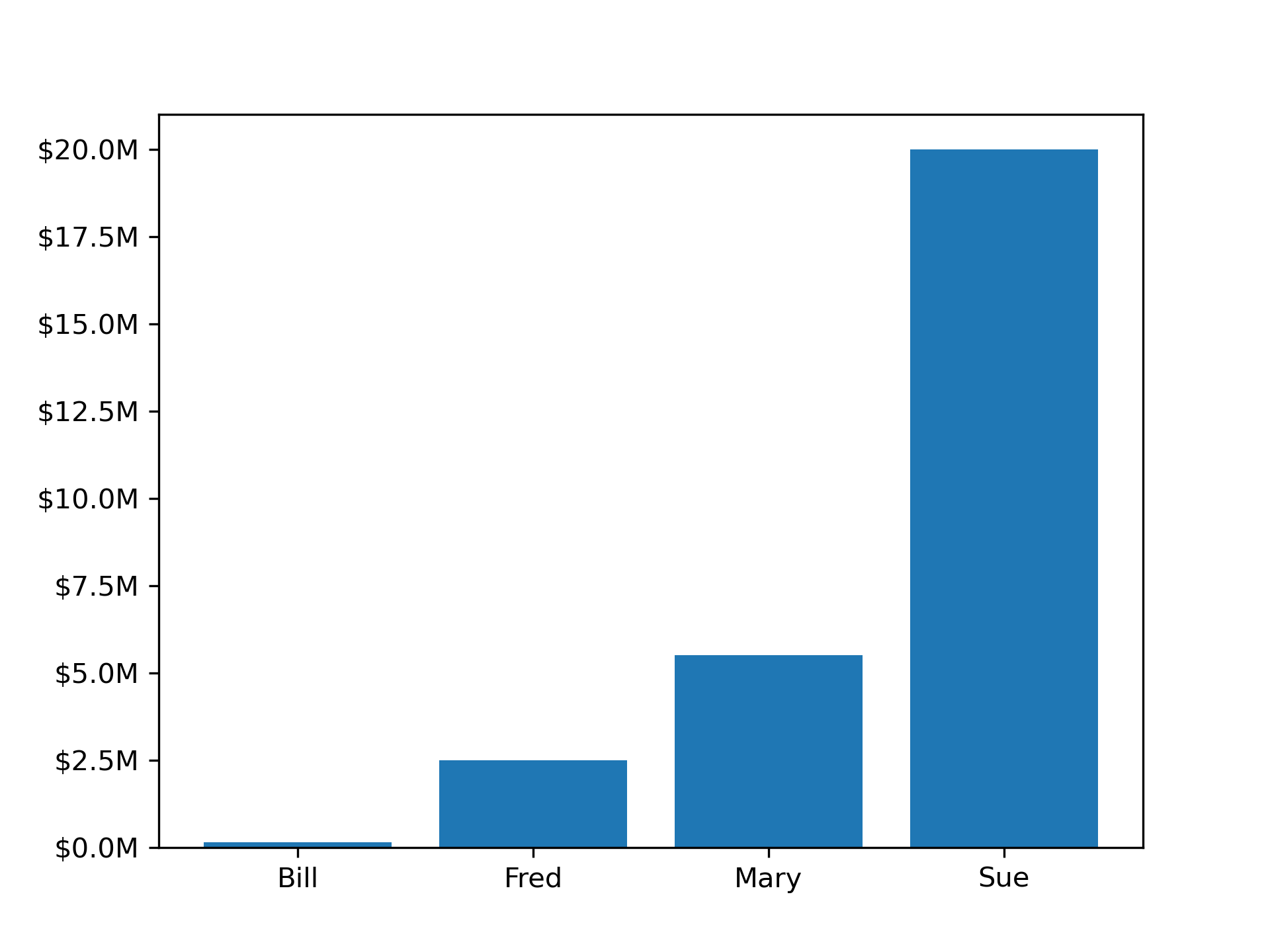
13.1.3. 柱状图
from matplotlib.ticker import FuncFormatter
import matplotlib.pyplot as plt
import numpy as np

x = np.arange(4)
money = [1.5e5, 2.5e6, 5.5e6, 2.0e7]

def millions(x, pos):
    'The two args are the value and tick position'
    return '$%1.1fM' % (x * 1e-6)

formatter = FuncFormatter(millions)

fig, ax = plt.subplots()
ax.yaxis.set_major_formatter(formatter)
plt.bar(x, money)
plt.xticks(x, ('Bill', 'Fred', 'Mary', 'Sue'))
plt.show()
运行结果如下
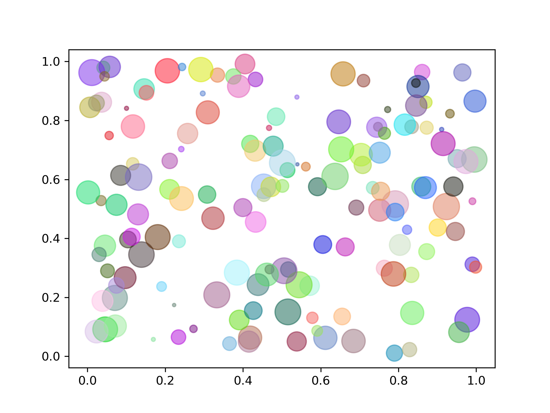
13.1.4. 散点图
import numpy as np
import matplotlib.pyplot as plt

n = 150
x = np.random.rand(n,3)
c = np.random.rand(n,3)
plt.scatter(x[:,0], x[:,1], s=x[:,2]*500, alpha=0.5, color=c)
plt.show()
运行结果如下
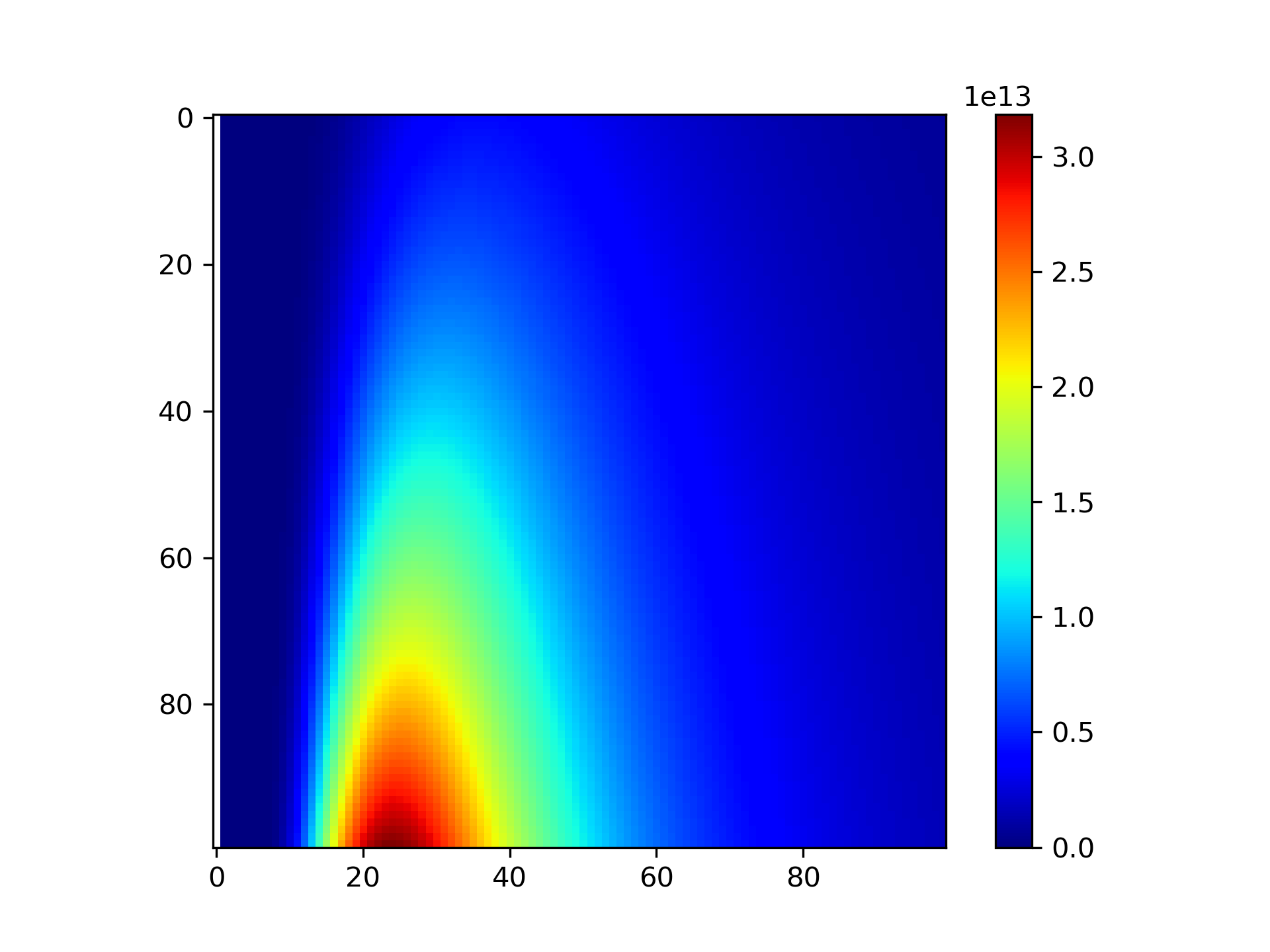
13.1.5. 热力图
import numpy as np
import matplotlib.pyplot as  plt

# Planck's law
def bbfunc(lam, T):
    h = 6.626e-34
    c = 2.99792e+8
    k = 1.3806e-23
    lam = lam * 1e-9
    ddd = 2 * h * c**2 / lam**5 / (np.exp(h*c/(lam*k*T)) - 1)
    return ddd

lam = np.linspace(0, 2000, 100)
T = np.linspace(4000, 6000, 100)
X, Y = np.meshgrid(lam, T)
Z = bbfunc(X, Y)

plt.imshow(Z, cmap=plt.get_cmap('jet'))
plt.colorbar()
plt.show()

plt.imshow(Z[::-1],  cmap=plt.get_cmap('jet'), extent=[0, 2000, 4000, 6000])
运行结果如下
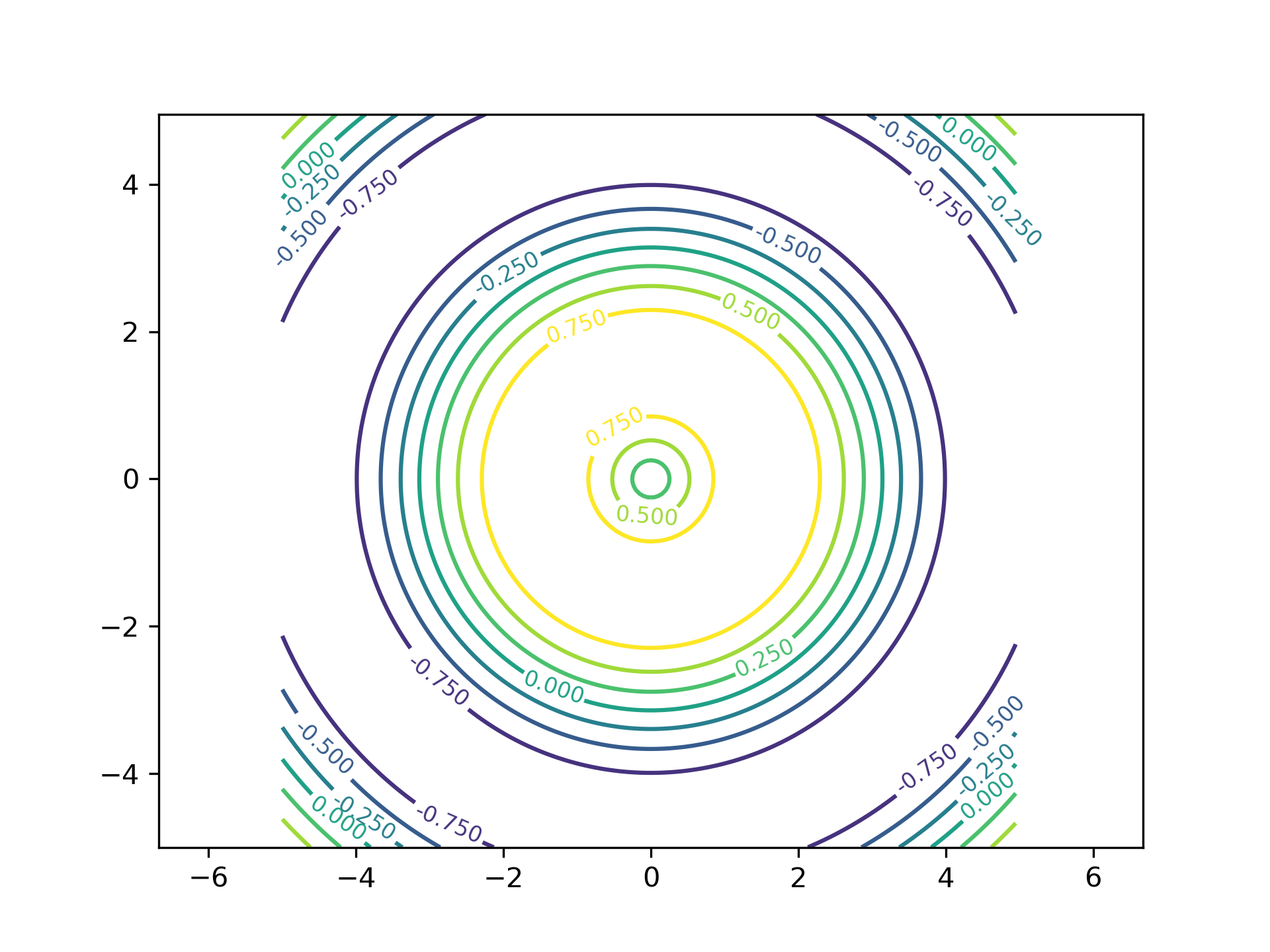
13.1.6. 等高线图
import matplotlib.pyplot as plt
import numpy as np

x = np.arange(-5, 5, 0.05)
y = np.arange(-5, 5, 0.05)
x, y = np.meshgrid(x, y)
z = np.sin(np.sqrt(x ** 2 + y ** 2))

plt.figure()
levels = np.arange(-1, 1, 0.25)
cs = plt.contour(x, y, z, levels)
plt.clabel(cs, inline=1, fontsize=8)
plt.axis('equal')
plt.xlim([-5, 5])
plt.show()
运行结果如下
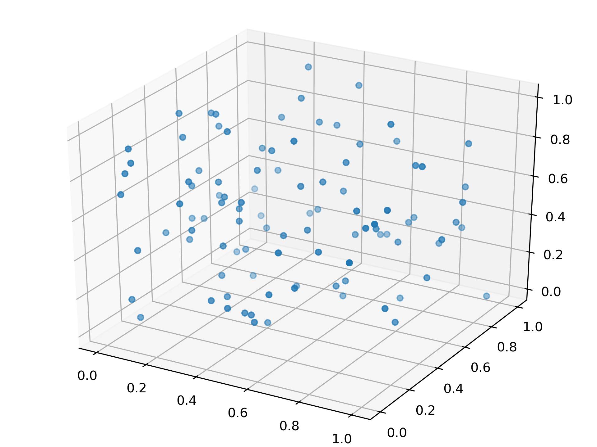
13.1.7. 三维散点图
import numpy as np
from matplotlib import pyplot as plt
from mpl_toolkits.mplot3d import Axes3D

fig = plt.figure()
ax = Axes3D(fig)
data = np.random.random([100, 3])
np.random.shuffle(data)
ax.scatter(data[:,0], data[:,1], data[:,2], marker='o')
plt.show()
运行结果如下
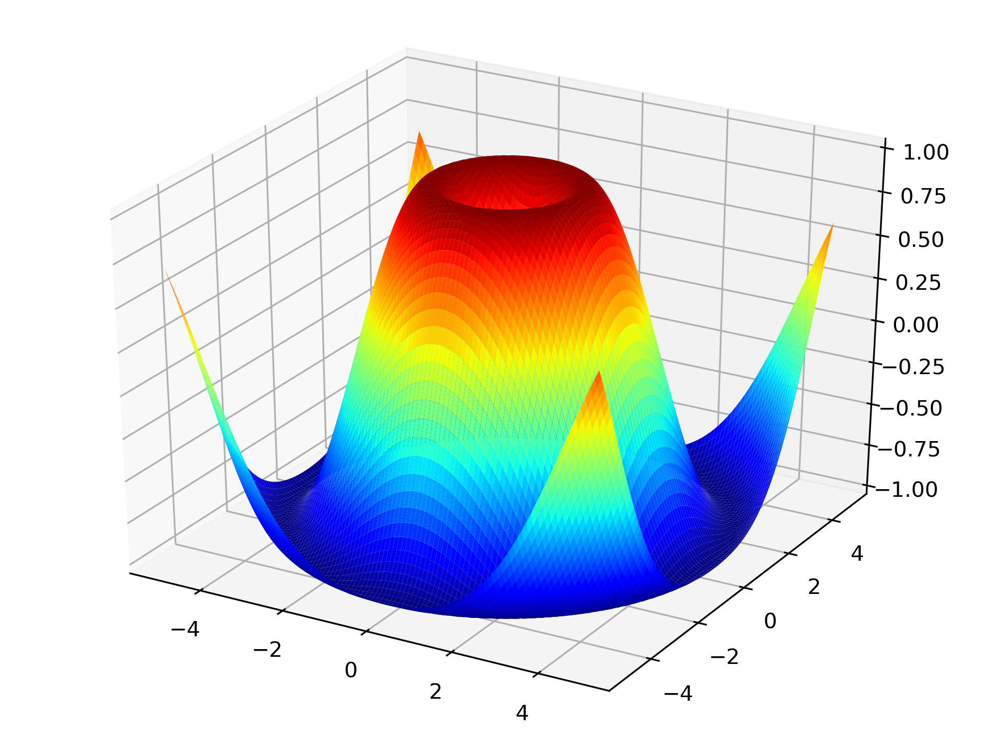
13.1.8. 三维曲面
import numpy as np
import matplotlib.pyplot as plt
from mpl_toolkits.mplot3d import Axes3D

x = np.arange(-5, 5, 0.1)
y = np.arange(-5, 5, 0.1)
x, y = np.meshgrid(x, y)
z = np.sin(np.sqrt(x**2 + y**2))

fig = plt.figure()
ax = Axes3D(fig)
ax.plot_surface(x, y, z, rstride=1, cstride=1, cmap='jet' )
ax.set_zlim(-1.01, 1.01)
plt.show()
运行结果如下
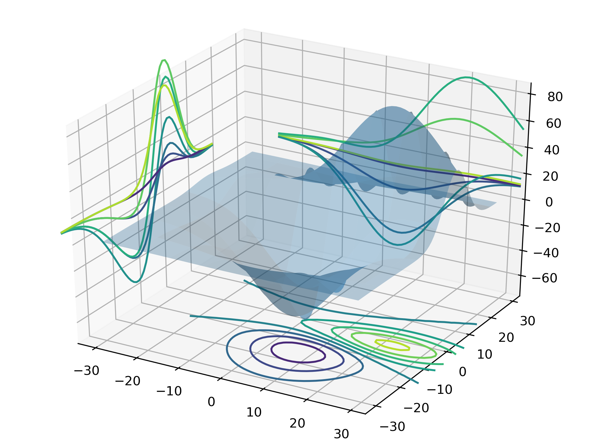
13.1.9. 三维投影
import matplotlib.pyplot as plt
from mpl_toolkits.mplot3d import Axes3D
from mpl_toolkits.mplot3d import axes3d

fig = plt.figure()
ax = Axes3D(fig)
x, y, z = axes3d.get_test_data(0.1)
ax.plot_surface(x, y, z, rstride=8,cstride=8, alpha=0.3)
cset = ax.contour(x, y, z, zdir='z', offset=-100)
cset = ax.contour(x, y, z, zdir='x', offset=-40)
cset = ax.contour(x, y, z, zdir='y', offset=40)
plt.show()
运行结果如下
Matplotlib 中常见的三维绘图函数有
- plot3D:三维控件绘图
- plot_surface:三维网格曲面
- plot_trisurf:三维三角曲面
- plot_wireframe:三维线图
- quiver3D:三维矢量图
- scatter:散点图(可三维)
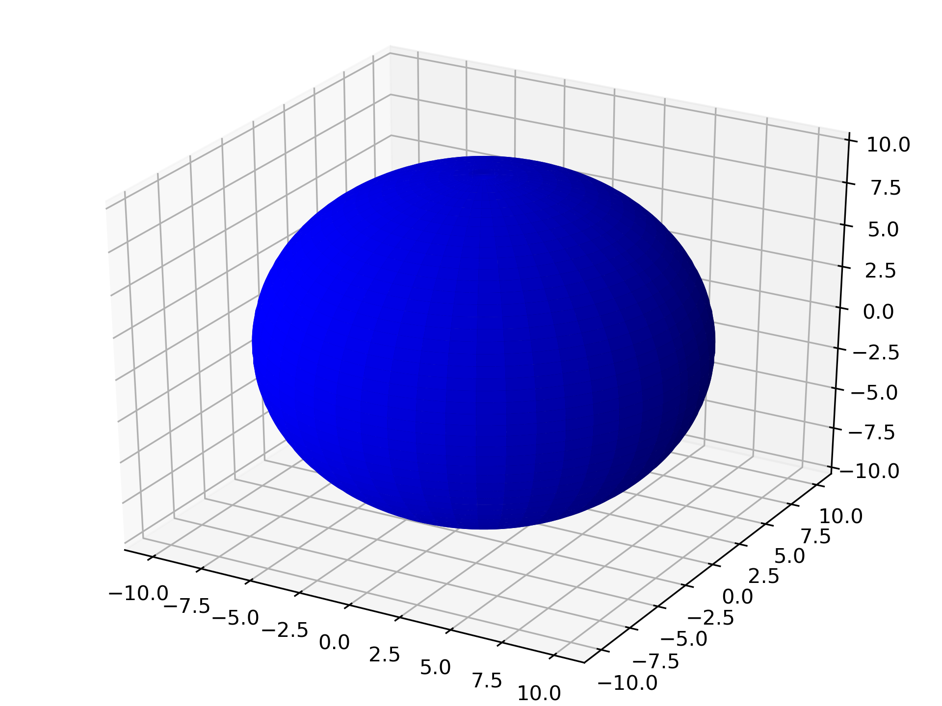
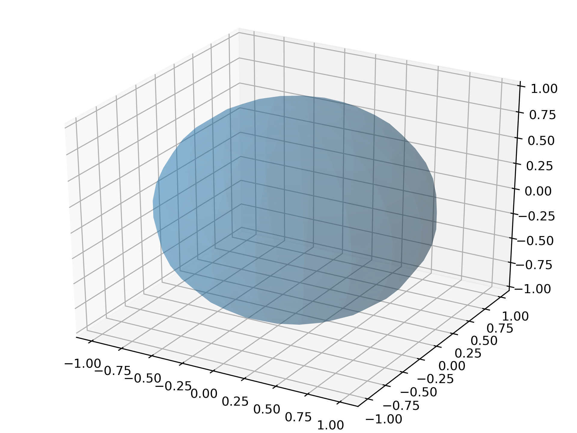
13.1.10. 三维球面
有两种方法。第一种方法是
from mpl_toolkits.mplot3d import Axes3D
import matplotlib.pyplot as plt
import numpy as np

fig = plt.figure()
ax = Axes3D(fig)
u = np.linspace(0, 2 * np.pi, 100)
v = np.linspace(0, np.pi, 100)
x = 10 * np.outer(np.cos(u), np.sin(v))
y = 10 * np.outer(np.sin(u), np.sin(v))
z = 10 * np.outer(np.ones(np.size(u)), np.cos(v))

ax.plot_surface(x, y, z, rstride=2, cstride=2, color='b')
plt.show()
第二种方法是
import numpy as np
import matplotlib.pyplot as plt
from mpl_toolkits.mplot3d import Axes3D

fig = plt.figure()
ax = Axes3D(fig)
u, v = np.ogrid[0:2*np.pi:20j, 0:np.pi:20j]
x = np.cos(u) * np.sin(v)
y = np.sin(u) * np.sin(v)
z = np.cos(v)
ax.plot_surface(x, y, z, rstride=1, cstride=1, alpha=0.3)
plt.show()
13.1.11. 动画绘制
Matplotlib 中包含生成动画的子模块 animation,我们通过下面的例子来看一下它的用法。
import numpy as np
import matplotlib.pyplot as plt
import matplotlib.animation as ani

fig, ax = plt.subplots()
x = np.arange(0, 2*np.pi, 0.01) # x-array
line, = plt.plot(x, np.sin(x))

def animate(i):
    line.set_ydata(np.sin(x + i / 100))
    return line,

def init():
    line.set_ydata(np.sin(x))
    return line,

ani = ani.FuncAnimation(fig=fig, func=animate, frames=100,
        init_func=init, interval=20, blit=False)
plt.show()
另外可以用 plt.ion() 来进行实时绘图
import numpy as np
import matplotlib.pyplot as plt

plt.ion() # 开始实时绘图
plt.show()

x = np.arange(0,2*np.pi,0.01)
line, = plt.plot(x,np.sin(x))
for i in np.arange(1,200):
    line.set_ydata(np.sin(x+i/10.0))
    plt.pause(0.05)
plt.ioff() # 关闭实时绘图
上面两个脚本运行的结果一样。如果能将得到的动画保存下来是最好的,生成可以播放的动画通常需要额外的视频编码器。这里我们先保存制作动画所需的单帧图像。
# 图片保存
import pylab as pl
import numpy as np
x = np.arange(0,2*np.pi,0.01)
for i in np.arange(200):
    pl.figure()
    pl.plot(x,np.sin (x+i /10.0))
    pl.savefig("YOUR_PREFERRED_DIR/{:0>3d}.png".format(i))
    # 换成你想保存的路径,注意不同操作系统下斜杠与反斜杠区别
接下来使用 imageio 进行动画文件制作
# 注意先运行上一个程序生成完图片再运行该程序生成动画
import imageio
import os

img_folder = "YOUR_PREFERRED_DIR"
# 排序
files = os.listdir(img_folder)
files.sort(key=lambda x: int(x[:3]))

frames = []
for file in files:
    img_path = os.path.join(img_folder, file)
    frames.append(imageio.imread(img_path))

imageio.mimsave("ani.gif", frames, 'GIF', duration=0.1)
最后得到的 GIF 是这样的
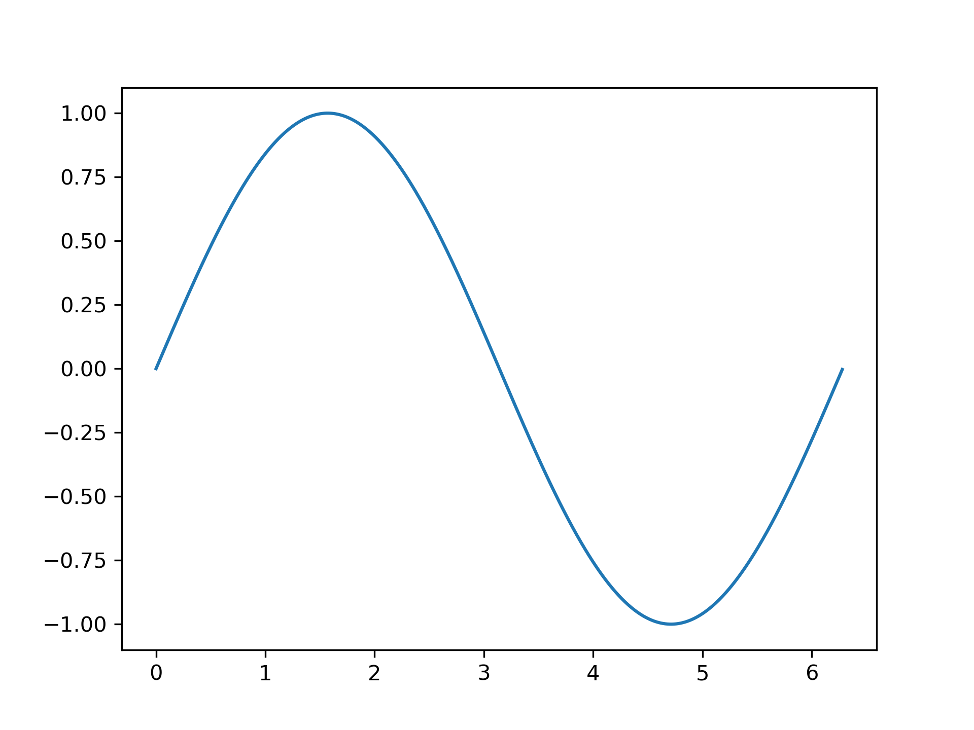
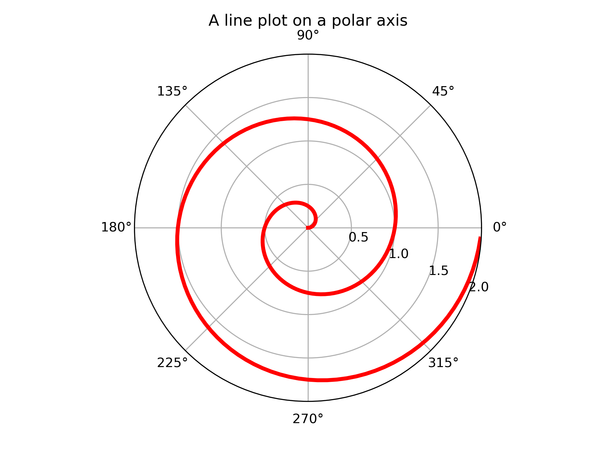
13.1.12. 极坐标
import numpy as np
import matplotlib.pyplot as plt

r = np.arange(0, 2, 0.01)
theta = 2 * np.pi * r

ax = plt.subplot(polar=True)
ax.plot(theta, r, c='r', lw=3)
ax.set_rmax(2)
ax.set_rticks([0.5, 1, 1.5, 2])  # Less radial ticks
ax.set_rlabel_position(-22.5)
ax.grid(True)

ax.set_title("A line plot on a polar axis", va='bottom')
plt.show()
运行结果如下
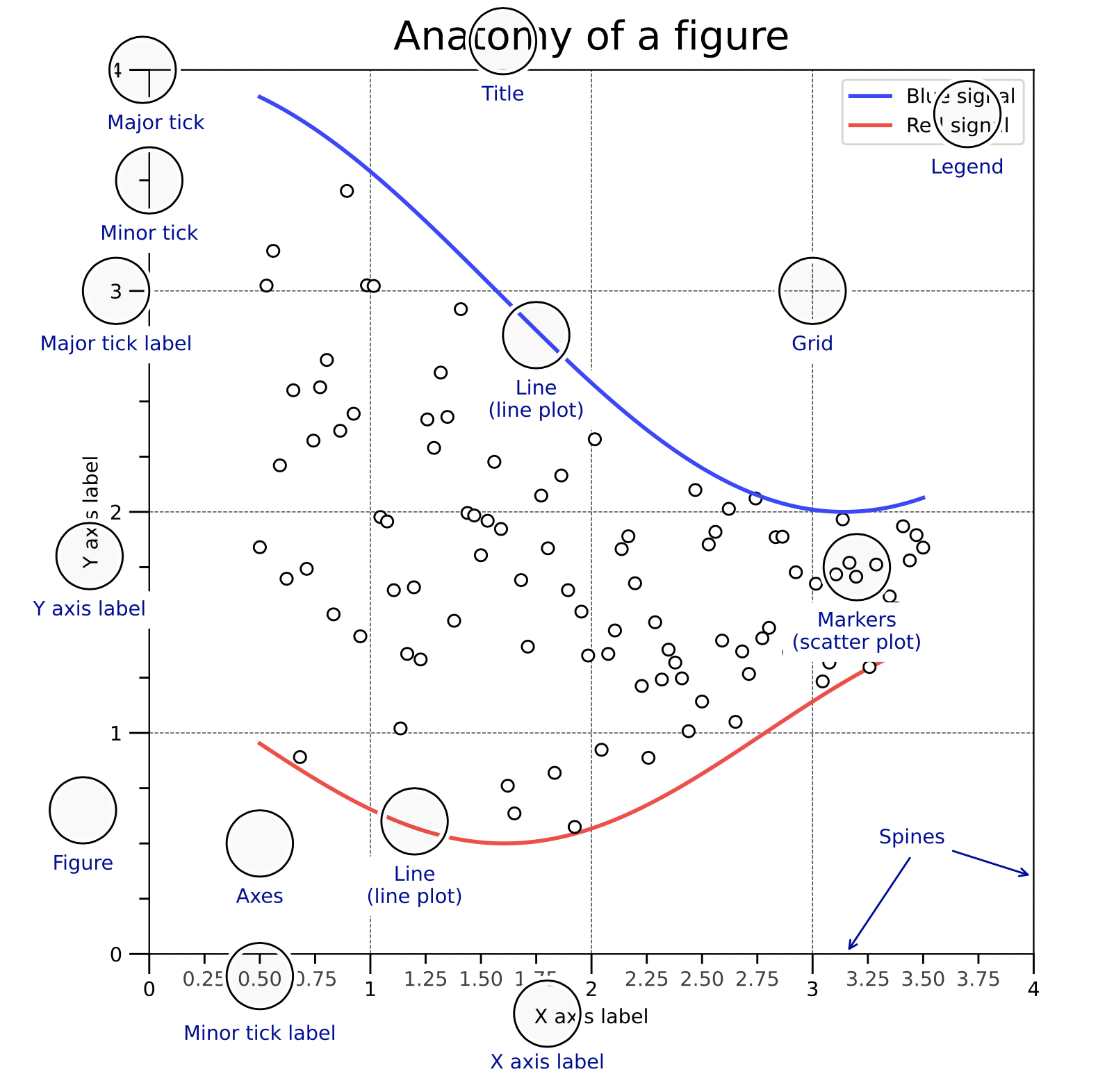
13.2. 作图详解
这一部分详细讲解作图的具体属性配置,下面这个图是 Matplotlib 一张图像的结构。
13.2.1. 画布和绘图区域
只要用到 Matplotlib 作图,必须首先创建一张画布(Figure),它包含组成图表的所有元素。 然后再在这个画布上创建一个绘图区域(Axes),Axes 是整个 Matplotlib 的核心,图表的精细调节都是基于 Axes 实现的。我们可以通过下面这些方式创建画布和绘图区域。
# 方式一
# 创建画布,并在画布上添加 Axes
fig = plt.figure()
ax = fig.add_subplot(111)

# 方式二
# 同时创建画布和 Axes
fig, ax = plt.subplots()
上面都是只有一个绘图区域的情形,两种方法等效。
13.2.2. 多子图
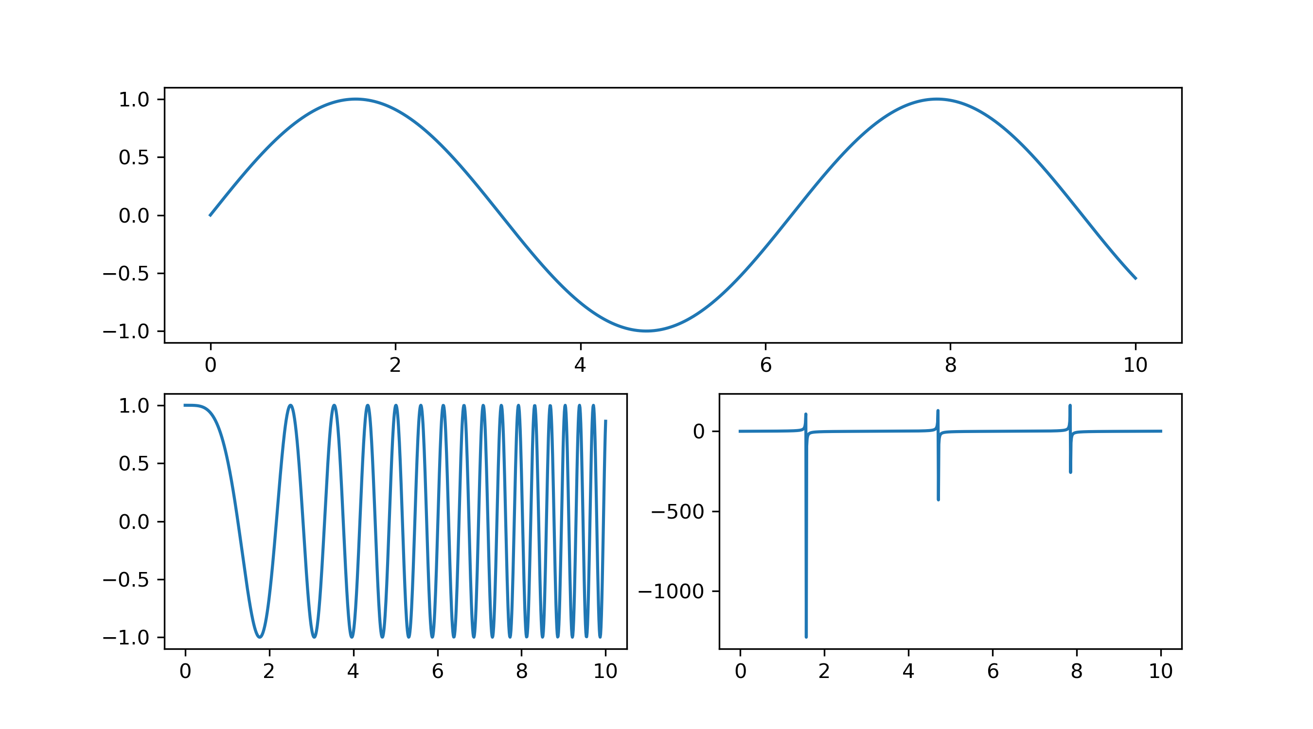
多子图就是同一张画布上有多个绘图区域,比如
import numpy as np
import matplotlib.pyplot as plt
x = np.linspace(0, 10, 1000)
y1 = np.sin(x)
y2 = np.cos(x**2)
y3 = np.tan(x)

fig = plt.figure()
ax1 = fig.add_subplot(211) # 第一行
ax1.plot(x, y1)
ax2 = fig.add_subplot(223) # 第二行左图
ax2.plot(x, y2)
ax3 = fig.add_subplot(224) # 第二行右图
ax3.plot(x, y3)
plt.show()
就能得到
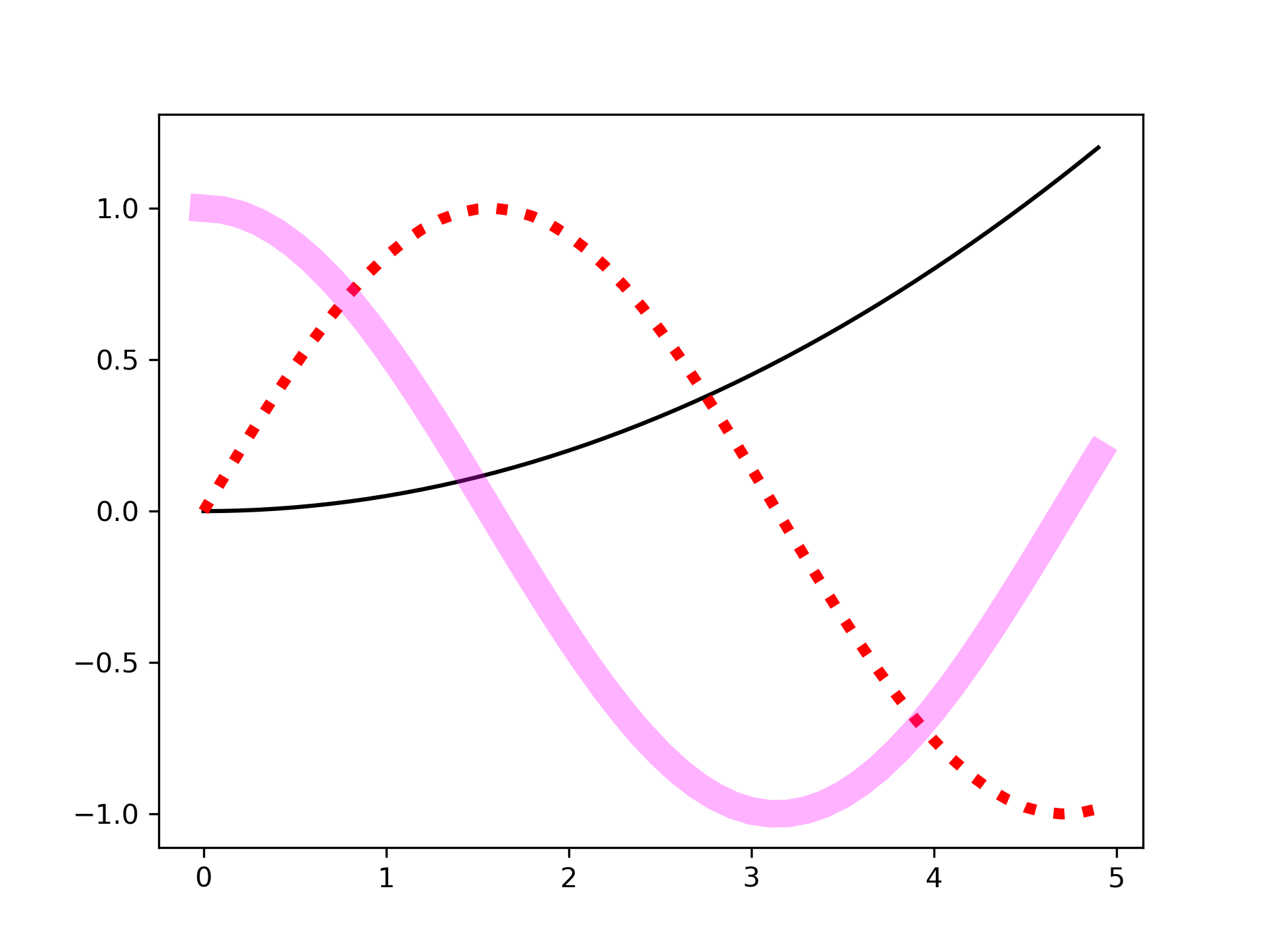
13.2.3. 作图
创建好画布和 Axes 之后,就要进行画图,这里以 ax.plot 为例,ax.plot 中常用的作图参数有
- color or c:曲线的颜色
- alpha:曲线的透明度
- linewidth or lw:曲线的宽度
- linestyle or ls:曲线的样式
- zorder:曲线叠放顺序
- label:图注名称
举个例子
import matplotlib.pyplot as plt
import numpy as np

x = np.arange(0, 5, 0.1)

fig, ax = plt.subplots()
ax.plot(x, 0.05*x**2, color='black')
ax.plot(x, np.sin(x), color='red', linewidth=4, linestyle=':')
line = ax.plot(x, np.cos(x), color='magenta', linewidth=10)[0]
# 可以通过调用 Line2D 对象的 set_* 的方法来设置属性值
line.set_alpha(0.3)

# 保存图像并设置图像分辨率
fig.savefig('ax.plot.png', dpi=300)
plt.show()
可以得到
13.2.4. 颜色控制
在 Matplotlib 中有很多种方式可以表示颜色,下面列出几种常用的方式(参考 Matplotlib - Specifying Colors)
Named Color
有一些颜色是有名字的,在使用这些颜色的时候可以直接指定它们的名字来获取。


RGB/RGBA
通过指定 RGB 或者 RGBA 的元组来表示颜色,取值归一到 [0,1] ,比如 (0.1, 0.2, 0.5) 或 (0.1, 0.2, 0.5, 0.3)。 或者也可以用十六进制的颜色表示方式来代替元组,比如 ‘#0F0F0F’ 或 ‘#0F0F0F80’。
13.2.5. 坐标轴
坐标轴(Axis)是构成图像的最重要的部分之一,它包括坐标轴上的刻度线、刻度文本、坐标网格以及坐标轴标题等内容。我们经常需要对坐标轴进行定制。
对数坐标轴
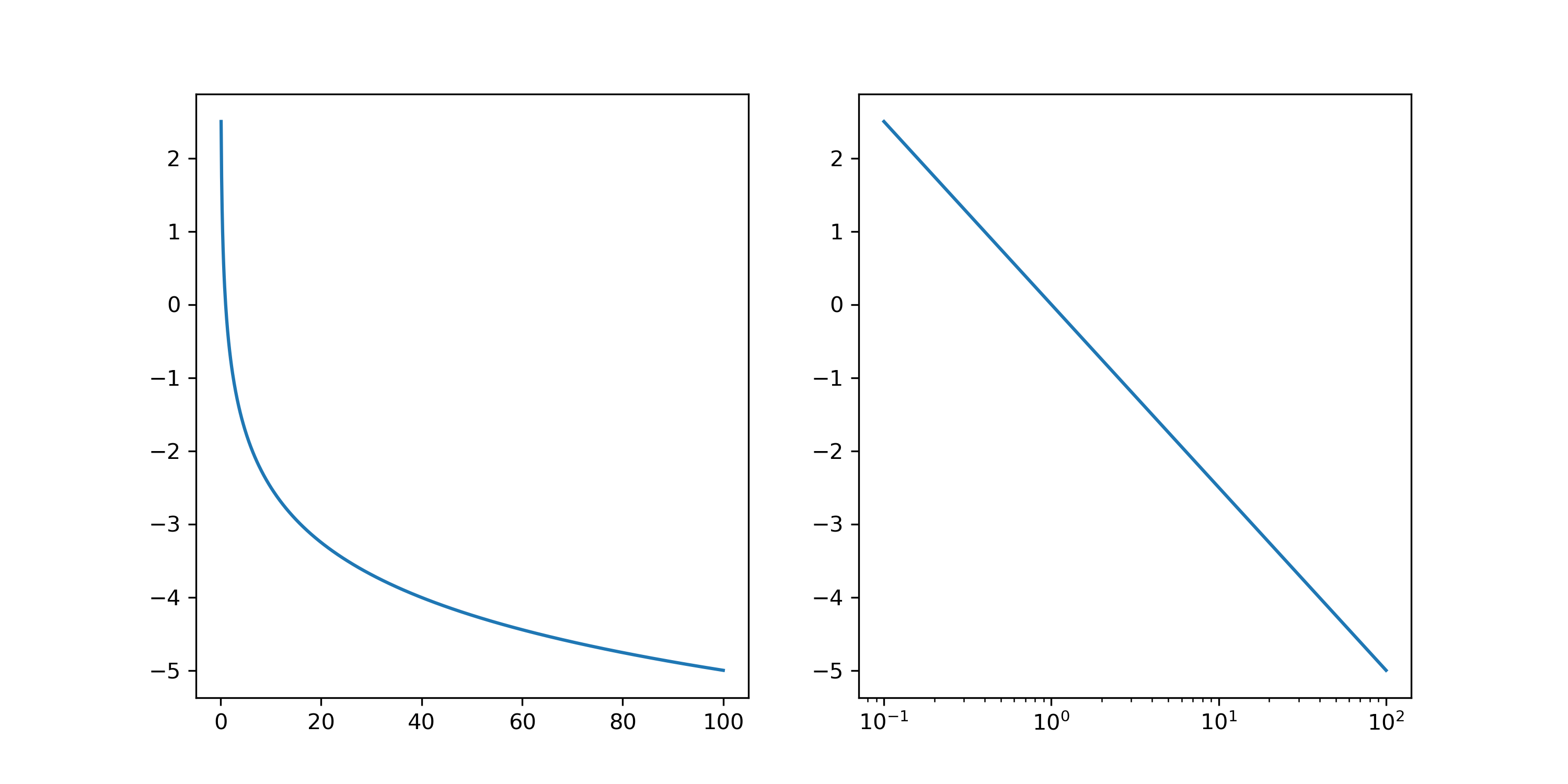
在科学研究中经常需要用到对数坐标,比如天文学中绝对星等和亮度的关系等。
import numpy as  np
import matplotlib.pyplot as plt

lmn = np.linspace(1.e-1, 100, 1000)
mag = -2.5 * np.log10(lmn)

fig = plt.figure()
ax = fig.add_subplot(121)
ax.plot(lmn, mag)

ax = fig.add_subplot(122)
ax.plot(lmn, mag)
ax.set_xscale('log')
plt.show()
我们可以得到下图,可以发现虽然在普通坐标轴下两个变量关系是非线性的,但在对数的 X 坐标轴下,两者关系是线性的。